Intro
Poor navigation kills more websites than bad design ever will. When users can’t figure out where to click next, they leave.
According to research, 61.5% of people abandon sites because navigation confuses them. That’s a huge number, and it means most sites are bleeding visitors before they even have a chance to convert them.
The brands that get this right don’t rely on clever tricks or unusual menus. They use specific UX patterns that remove friction from every interaction. These patterns are deliberate choices about how information gets organized and presented.
We’ve studied dozens of high-performing sites to identify what actually works. The patterns we’ll cover below show up across industries, from ecommerce to SaaS platforms. Each one solves a specific navigation problem, and you can implement them without overhauling your entire site.
Let’s break down what real brands did and how you can adapt their approach.
Sticky Navigation as a Momentum-Preserving Pattern
Sticky navigation keeps essential options visible as users scroll. It removes friction at moments when people decide what to do next.
On long pages, that matters. Users often form intent mid-read. Persistent navigation lets them act right away without breaking focus or scrolling back to the top.
The All-in-One Platform for Effective SEO
Behind every successful business is a strong SEO campaign. But with countless optimization tools and techniques out there to choose from, it can be hard to know where to start. Well, fear no more, cause I've got just the thing to help. Presenting the Ranktracker all-in-one platform for effective SEO
We have finally opened registration to Ranktracker absolutely free!
Create a free accountOr Sign in using your credentials
This pattern respects momentum. Users don’t need to pause, reorient, or search for controls. The site responds as quickly as they think. Over time, this builds trust and reduces drop-off, especially on pages that mix education, pricing, and conversion paths.
The value depends on execution. Sticky navigation should feel supportive, not dominant. Poorly handled, it steals space or distracts from content. Clean implementation keeps it useful and quiet.
How to implement sticky navigation:
- Determine the single purpose of the menu before designing it. Support the most common next step.
- Limit links to core pages only, such as products, pricing, contact, and ordering.
- Keep the height compact and consistent across pages.
- Ensure a strong contrast between the menu and page content so it stays readable while scrolling.
- Use plain labels that match user intent, not internal terminology.
- Lock the menu position to avoid jitter or resizing during scroll.
- On mobile, test thumb reach and safe spacing around buttons.
- Consider scroll behavior carefully. If space becomes an issue, hide the menu on scroll down and reveal it on scroll up.
- Validate performance impact so the sticky element doesn’t slow down loading or scrolling.
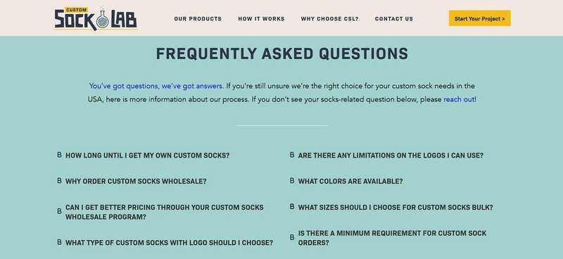
Custom Sock Lab is a brand that uses this pattern well. They create custom socks for businesses, events, teams, and individual customers.
Their sticky navigation stays visible across every page, even when you scroll down to the bottom. Users browsing styles, materials, or order details can switch paths instantly. The menu stays simple and consistent, helping visitors move through options without losing focus or progress.
Source: customsocklab.com
Hierarchical Menu Patterns That Match User Mental Models
Hierarchical menus work when they reflect how users already organize information in their heads.
The All-in-One Platform for Effective SEO
Behind every successful business is a strong SEO campaign. But with countless optimization tools and techniques out there to choose from, it can be hard to know where to start. Well, fear no more, cause I've got just the thing to help. Presenting the Ranktracker all-in-one platform for effective SEO
We have finally opened registration to Ranktracker absolutely free!
Create a free accountOr Sign in using your credentials
People don’t browse randomly. They arrive with a rough idea of what they want and expect categories to narrow choices in a logical order. Clear segmentation helps them move forward without second-guessing each click.
This pattern reduces friction by answering silent questions early. Users see where they are, what sits under each category, and how deep they can go. That clarity shortens decision time and lowers bounce rates, especially on sites with large inventories or technical products. It also builds confidence. When categories feel familiar, users trust they’ll find what they need.
Execution matters here. Poor hierarchy creates clutter or forces users to relearn structure. Strong hierarchy feels obvious from the first glance.
How to implement hierarchical menus:
- Group items based on user intent, not internal product logic.
- Limit top-level categories to a manageable number.
- Use plain, descriptive labels that match search language.
- Reveal subcategories on hover or tap without delay.
- Keep category depth shallow whenever possible.
- Maintain consistent structure across menus and sidebars.
- Order items by relevance, not alphabet.
- Add visual spacing to separate groups clearly.
- Support filtering inside categories for faster narrowing.
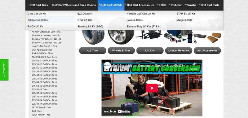
Golf Cart Tire Supply applies this approach with discipline. They supply golf cart tires, wheels, and related accessories for maintenance and upgrades.
Their main menu shows product categories that expand on hover, revealing either products or clear subcategories right away. Users don’t need to click blindly. On the homepage, a left sidebar reinforces the same structure. It segments products by details like size and type, helping visitors narrow choices fast.
Both navigation systems follow the same logic, which keeps exploration predictable and efficient.
Source: golfcarttiresupply.com
Attribute-Driven Menu Design That Mirrors How Buyers Filter Products
Attribute-driven menus organize navigation around the details buyers care about most. Instead of leading with broad categories alone, these menus surface attributes like type, color, material, or use case early.
This aligns navigation with how people actually shop, especially when catalogs feel large or similar at first glance.
This strategy shortens decision paths. Buyers often know key constraints before they browse. They might care about fit, audience, or appearance more than brand names or collections. Attribute-based navigation lets them apply those constraints upfront. That reduces scanning time and lowers frustration. It also helps users feel in control, which increases confidence during selection.
To succeed, this approach needs focus and restraint. Too many attributes overwhelm, while poor labeling confuses. The goal stays clarity, not completeness.
How to implement attribute-driven navigation:
- Identify the attributes users rely on most when comparing products.
- Validate those attributes with search data and support questions.
- Limit visible attributes to the strongest decision drivers.
- Use consistent labels across menus, filters, and product pages.
- Order attributes by importance, not internal priority.
- Allow users to combine attributes without resetting results.
- Keep selections visible so users understand active filters.
- Ensure performance stays fast as filters update.
- Mirror attribute logic across desktop and mobile layouts.
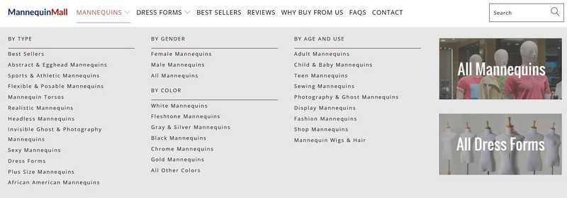
Mannequin Mall, which sells display mannequins for retail and fashion, structures their entire navigation around product attributes.
They organize products by mannequin type, gender presentation, age group, and color. This matches how buyers narrow options when working with display requirements or brand standards. Visitors can filter quickly without guessing category paths.
The structure supports fast comparison and helps users reach relevant products with fewer steps.
Source: mannequinmall.com
Footer Navigation as a Secondary Discovery Pattern
Footer navigation supports users who reach the bottom of a page without taking action. At that point, they’re still interested but unsure where to go next. A well-structured footer gives them direction without forcing a scroll back to the top. It works as a quiet safety net for continued exploration.
This pattern helps because scrolling often signals evaluation. Users read, compare, and pause near the end of a page. When the footer offers clear next steps, it keeps momentum alive. It also surfaces content that doesn’t belong in primary navigation, such as guides, comparisons, or trust-focused pages. That improves discoverability without cluttering the main menu.
Execution depends on clarity and structure. A footer should feel organized and purposeful. Overloaded footers slow decision-making and get ignored.
How to design effective footer navigation:
- Group links by intent, such as research, comparison, support, and company info.
- Use short, descriptive labels that explain value at a glance.
- Prioritize high-utility pages over legal or low-interest links.
- Keep column layouts consistent across pages.
- Add visual spacing between groups to improve scanability.
- Avoid duplicating the entire main menu without refinement.
- Include contextual links tied to page content when possible.
- Ensure links remain readable on smaller screens.
- Review footer analytics to identify which links earn engagement.
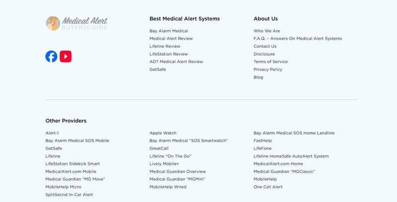
Medical Alert Buyer’s Guide uses footer navigation as a practical fallback layer. The site focuses on reviewing and comparing medical alert systems for older adults and caregivers.
When users scroll through long reviews or comparison content, the footer presents clear access to supporting pages like buying guides, FAQs, and contact resources.
This structure helps visitors continue research without friction. The footer doesn’t overwhelm. It simply offers logical next steps when users reach the end of the page and need direction.
Source: medicalalertbuyersguide.org
Contextual Navigation That Adapts to the User Journey
Contextual navigation changes based on where users are and what they’re trying to do. Instead of forcing one menu to serve every scenario, the interface adjusts as intent becomes clearer. This keeps navigation relevant and prevents users from sorting through options that no longer apply.
User needs shift as they move through a site. Early visits focus on orientation and trust. Deeper visits focus on learning, comparison, or task completion. Context-aware navigation supports those shifts by presenting links that match the current stage. That reduces distraction and helps users move forward with less effort.
The benefit depends on consistency. Sudden changes confuse users if the logic isn’t clear. Successful contextual navigation feels natural because it builds on the structure users already understand.
How to implement contextual navigation:
- Define user journeys before designing navigation states.
- Keep global navigation stable for top-level movement.
- Introduce contextual menus only when intent narrows.
- Use layout changes that signal a new content mode.
- Limit contextual links to actions relevant to the current section.
- Maintain consistent labels across global and local menus.
- Ensure users can return to higher-level pages easily.
- Test transitions so navigation shifts feel predictable.
- Avoid duplicating global links inside contextual menus.
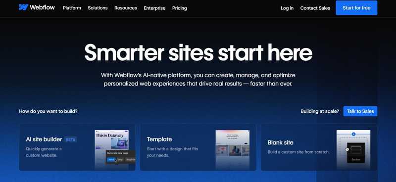
A prime example of this strategy is Webflow, a visual development platform that lets designers build professional websites without writing code.
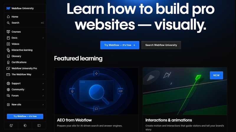
On the homepage, the menu includes expected SaaS sections like Platform, Solutions, Resources, and Pricing. When users enter the Resources area, the navigation shifts to a sidebar tailored to learning. Links focus on courses, glossaries, certifications, and educational content.
This change supports a research-driven mindset without removing access to the main site structure. The navigation adapts without disorienting, which keeps exploration focused and efficient.
Source: webflow.com
Source: webflow.com
Predictive Search Patterns That Guide Users as They Type
Predictive search helps users reach results faster by responding in real time. As people type, the interface anticipates intent and offers suggestions before they finish a query. This works well on sites with large catalogs where browsing alone takes too long.
This pattern reduces effort at a critical moment. Users often know part of what they want but not the exact wording. Predictive search fills that gap by suggesting relevant terms, categories, and products instantly. It lowers error rates, shortens paths to results, and keeps users engaged instead of forcing trial-and-error searches. It also supports discovery by surfacing options users may not have considered.
Strong execution relies on relevance and restraint. Too many suggestions confuse. Poor ranking erodes trust. The experience should feel fast, focused, and helpful.
How to implement predictive search:
- Place search where users expect it and make it easy to activate.
- Expand the search field to signal focus and intent.
- Show suggestions after the first few characters.
- Rank suggestions by popularity and relevance.
- Include multiple result types, such as products, categories, and content.
- Highlight matching terms clearly within results.
- Keep results scannable with spacing and visual hierarchy.
- Limit the number of visible results to avoid overload.
- Ensure performance stays instant across devices.
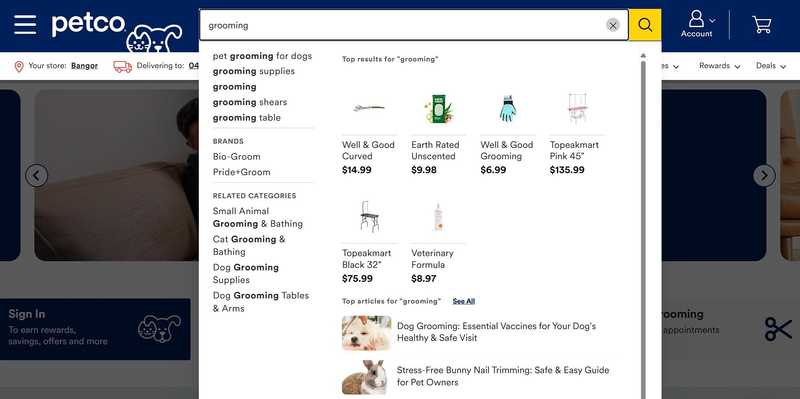
Petco, selling pet food, treats, supplies, and accessories, applies predictive search at scale. Their main navigation features a prominent search bar that expands as soon as users click into it.
As users type, the interface predicts queries and displays related search terms, brands, and categories. It also shows product results and related articles inside the same expanded window. Users can move from idea to action without leaving the search state.
This setup supports both quick purchases and broader research while keeping the experience focused and responsive.
The All-in-One Platform for Effective SEO
Behind every successful business is a strong SEO campaign. But with countless optimization tools and techniques out there to choose from, it can be hard to know where to start. Well, fear no more, cause I've got just the thing to help. Presenting the Ranktracker all-in-one platform for effective SEO
We have finally opened registration to Ranktracker absolutely free!
Create a free accountOr Sign in using your credentials
Source: petco.com
Final Thoughts
Smart navigation removes effort without calling attention to itself. The patterns covered here work because they respect how people browse, decide, and move through content.
Persistent menus support momentum. Clear hierarchies match expectations. Attribute-based paths reflect real buying behavior. Contextual navigation adapts as intent sharpens. Predictive search shortens the distance between need and result.
These approaches succeed when they stay disciplined. Each pattern serves a specific purpose and appears only where it adds value.
For your next steps, review how users move through your site. Identify where they hesitate, backtrack, or leave. Then apply the pattern that fits that moment in the journey. Small navigation improvements often deliver outsized gains in engagement and conversion.

