Intro
In December 2022, Google introduced the "About this site" feature under some search result snippets, primarily aimed at users looking to learn more about a brand. Initially, this feature presented a sparse textual box with details about the source. Now, Google is enhancing this information by testing a more graphical user interface.
Enhanced Graphical Interface
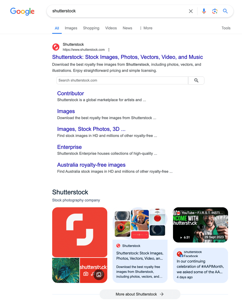
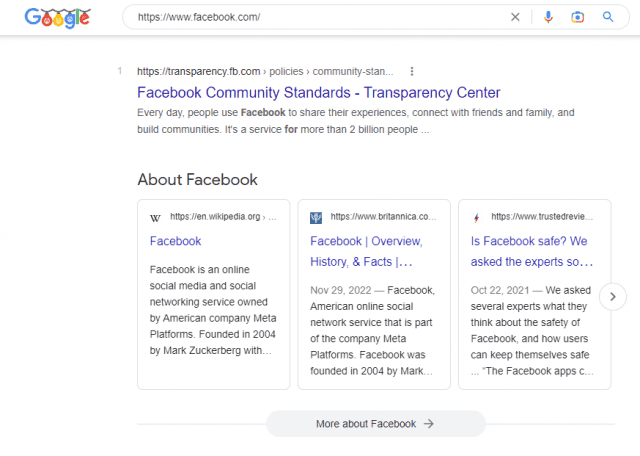
Brodie Clark posted screenshots on X showcasing this new interface, which resembles the graphical knowledge panels that Google has used for many years. The updated design offers a more visually engaging way to present information about a site, making it easier for users to access and understand the details.

Old vs. New Interface

The previous version of the "About this site" feature was minimalistic, focusing on text. The new design integrates visuals, making it more informative and user-friendly. This change aligns with Google's ongoing efforts to enhance the user experience by providing richer, more accessible information.
Implications for Users and Publishers
For users, this graphical interface means a more intuitive and informative way to learn about the sources behind search results. For publishers, it underscores the importance of maintaining accurate and comprehensive information about their sites, as this information is now more prominently displayed.
Conclusion
Google's move to add visuals to the "About this site" knowledge panels reflects its commitment to improving the user experience. By making information more visually engaging and accessible, Google continues to enhance the ways users interact with search results and learn about different brands and websites.

