Intro
The quality of a user’s experience on your site has never been more important. Google’s approach to search increasingly favors websites that are not only relevant and authoritative but also offer a seamless, enjoyable browsing experience. From mobile optimization to page speed and user-friendly design, on-site user experience (UX) factors can tip the scales in your favor—or hold you back.
Below, we explore key UX elements and how they affect your rankings .
1. Mobile-First Indexing Readiness
As Google primarily uses the mobile version of your website for indexing and ranking, having a mobile-friendly design is crucial. If your site isn’t optimized for smaller screens, you risk losing visibility and potential visitors.
How to Be Mobile-Ready:
- Use responsive design techniques to adapt layouts for all devices.
- Ensure font sizes, buttons, and menus are easily accessible on mobile.
- Test your pages using Google’s Mobile-Friendly Test tool.
2. Core Web Vitals: LCP, FID, and CLS
Core Web Vitals are a set of performance metrics related to speed, responsiveness, and visual stability:
- Largest Contentful Paint (LCP): Measures loading performance. Aim for the main content to load within 2.5 seconds.
- First Input Delay (FID): Evaluates interactivity. Users should be able to interact within 100 ms of a page loading.
- Cumulative Layout Shift (CLS): Ensures visual stability. Keep unexpected layout shifts low, ideally with a score under 0.1.
These metrics influence your rankings and user satisfaction. Faster, more stable pages generally lead to better search performance.
How to Improve Core Web Vitals:
- Optimize images and use next-gen formats like WebP.
- Implement lazy loading for images and videos.
- Minimize JavaScript and CSS overhead with code minification and efficient caching.
3. Pop-Ups and Intrusive Interstitials
Overly aggressive pop-ups or full-screen interstitials—especially on mobile—frustrate users. Google has penalized sites that hinder accessibility to the main content, lowering their potential rankings.
- Use pop-ups sparingly and ensure they’re easy to dismiss.
- Trigger them after the user has had time to engage with the page (e.g., exit-intent pop-ups).
- Keep them small enough that users can still see the main content behind them.
4. Design Aesthetics and Usability
A visually appealing, intuitive design boosts user confidence and engagement. By focusing on a clean layout, readable typography, and consistent styling, you help users navigate and consume content effortlessly.
Design Tips for Better UX:
- Use whitespace and a clear visual hierarchy.
- Choose easy-to-read fonts and adequate font sizes.
- Align colors and branding consistently across all pages.
5. User Navigation Simplicity
Straightforward navigation structures help users find what they need quickly. Complex menus, hidden pages, or cluttered layouts can drive users away—signals that may negatively influence rankings over time.
The All-in-One Platform for Effective SEO
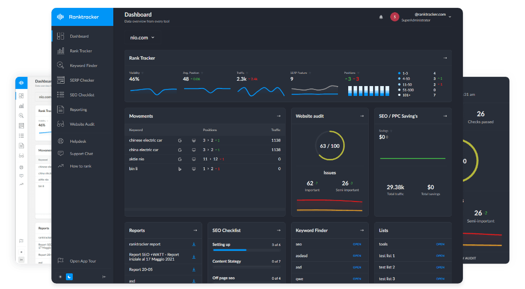
Behind every successful business is a strong SEO campaign. But with countless optimization tools and techniques out there to choose from, it can be hard to know where to start. Well, fear no more, cause I've got just the thing to help. Presenting the Ranktracker all-in-one platform for effective SEO
We have finally opened registration to Ranktracker absolutely free!
Create a free accountOr Sign in using your credentials
How to Simplify Navigation:
- Limit main menu items to essential categories.
- Use descriptive labels so users know exactly what they’ll find behind each link.
- Include a search bar to help visitors jump directly to desired content.
6. Breadcrumbs for UX
Breadcrumbs provide a secondary navigation aid, showing users where they are within the site’s hierarchy. This small but significant feature improves findability and reduces pogo-sticking, as visitors can easily move up a level if they land on the wrong page.
Breadcrumb Implementation Tips:
- Place breadcrumbs near the top of the page, just below the main navigation.
- Ensure breadcrumb labels accurately describe each page level.
- Consider using structured data for breadcrumbs so they can appear in Google’s search results.
7. AMP Implementation (Accelerated Mobile Pages)
AMP is a technology designed to load pages almost instantly on mobile devices. While not a direct ranking factor anymore, faster load times and improved mobile UX can indirectly benefit your SEO by increasing user satisfaction and engagement.
When to Use AMP:
- For news articles, blogs, and other content where speed matters most.
- If your primary audience relies heavily on mobile devices and slow networks.
- For large publishers and news sites looking to improve the mobile user experience.
Conclusion
On-site user experience factors transcend mere aesthetics. They shape how your visitors interact with your content, impact how long they stay on your site, and ultimately influence how search engines perceive your pages. By prioritizing mobile-first design, optimizing for Core Web Vitals, avoiding intrusive pop-ups, and streamlining navigation, you set a strong foundation for a site that both users and Google will favor.
Key Takeaways:
- Mobile-friendly design and responsive layouts are non-negotiable.
- Core Web Vitals (LCP, FID, CLS) directly impact rankings and user satisfaction.
- Avoid intrusive interstitials and pop-ups that disrupt user engagement.
- Clear, intuitive navigation and breadcrumb paths enhance UX.
- Consider AMP for lightning-fast load times on mobile.
Focusing on on-site user experience isn’t just a courtesy to your audience—it’s a strategic move that can help you climb the search results and earn more loyal visitors.

