Intro
With the surge in mobile device usage, the SEO landscape has evolved significantly. Understanding the differences between mobile and desktop rankings is crucial for optimizing your website and ensuring visibility across all devices. Here, we break down the key differences and explain why these variations occur.
1. Elements Shown in the Search Results Page
Mobile:
-
Simplified URLs: Mobile search results often display simplified URLs, usually showing just the domain or in a breadcrumb format.
-
Short Meta Descriptions: Meta descriptions on mobile are shorter due to screen size limitations.
-
Rich Snippets: Display more compactly with essential information prioritized.
-
Local Map Pack: Dominates the top results, pushing organic listings lower.
Desktop:
-
Full URLs and Longer Meta Descriptions: Desktop results display more of the URL and longer meta descriptions.
-
Horizontal Layout: Features like site links and People Also Ask are displayed horizontally, allowing for more content to be visible without scrolling.
-
Knowledge Panels: Often appear on the right side, providing more context and content in the search results.
2. Click-Through Rates (CTR)
Mobile:
-
The CTR is generally lower on mobile, with a more significant drop-off as you move down the rankings.
-
The #1 position has a CTR of around 28.36%, with a steep decline for lower positions.
Desktop:
-
Desktop search results tend to have higher CTRs, with the #1 position achieving around 39.8% CTR.
-
The spread between positions is less steep compared to mobile, indicating users are more likely to scroll through results.
3. The Device’s Operating System
Mobile:
-
Google tailors search results based on the mobile operating system, especially for queries with app-related intent.
-
Different operating systems (iOS vs. Android) can lead to variations in search results for the same query.
Desktop:
- The operating system has less impact on desktop search results, focusing more on browser and user preferences.
4. User Experience and Design
Mobile:
-
Mobile rankings heavily favor websites that are optimized for smaller screens, with responsive designs, fast loading times, and easy navigation.
-
Tap-friendly buttons and clear, simple layouts are critical.
Desktop:
- While user experience is also important, desktop sites have more flexibility with design complexity and media usage without negatively impacting load times or rankings.
5. Load Time
Mobile:
-
Load time is a critical ranking factor, with a significant emphasis on fast-loading pages due to often slower mobile network speeds.
-
The ideal mobile page load time is under 3 seconds.
Desktop:
- Although still important, desktop users are generally more tolerant of slightly slower load times, and the ideal load time is under 3 seconds.
6. Local SEO
Mobile:
- Mobile searches often have a strong local intent, with Google My Business listings and location-based services playing a significant role in rankings.
Desktop:
- While local SEO is still relevant, it is typically less emphasized than on mobile devices.
7. Keyword Usage
Mobile:
- Mobile users tend to use more conversational, long-tail keywords, often utilizing voice search.
Desktop:
- Desktop users typically input shorter, more specific queries, making exact-match keywords more effective.
8. Content Structure
Mobile:
- Content needs to be concise, easily scannable, and optimized for quick answers. Accelerated Mobile Pages (AMP) can improve mobile rankings.
Desktop:
- Longer, more detailed content is often more effective, as desktop users are more likely to engage with in-depth information.
Why Do Mobile and Desktop Search Results Differ?
Several factors contribute to the differences in search results between mobile and desktop:
-
Personalization: Google uses past searches and user behavior to personalize results, which can differ by device.
-
Geography: Location plays a significant role, with mobile devices often providing more localized results.
-
User Intent: Mobile users are often seeking immediate, location-based information, while desktop users may be more research-oriented.
Strategies to Increase Rankings on Mobile and Desktop Search Results
-
Ensure Consistency Across Devices: Deliver the same experience on both mobile and desktop, ensuring that content, structured data, and meta tags are consistent.
-
Responsive Design: Implement designs that adapt seamlessly to different screen sizes.
-
Improve Core Web Vitals: Focus on optimizing metrics like load time, interactivity, and visual stability.
-
Prioritize Mobile-First Indexing: With Google’s mobile-first indexing, ensure your mobile site is fully optimized.
-
Link-Building: Build a strong backlink profile that supports both mobile and desktop SEO.
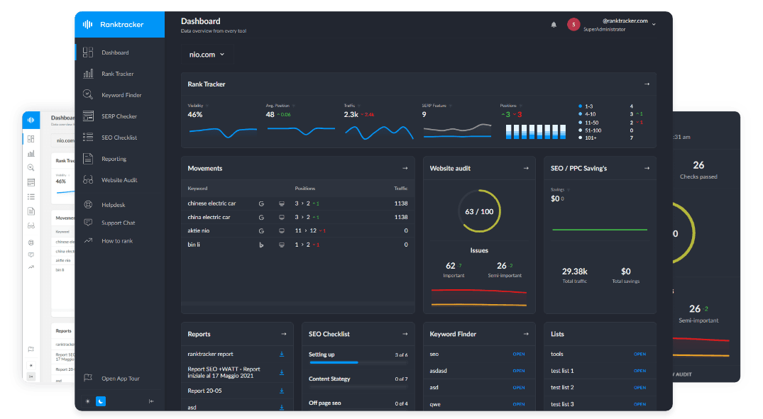
Tracking your site’s performance across both mobile and desktop search results is vital for maintaining and improving your SEO efforts. Tools like Ranktracker allow you to monitor keyword rankings and optimize your strategy effectively.
By understanding and addressing these differences, you can enhance your website’s visibility and performance across all devices.

