Intro
Let’s take a moment to imagine ourselves in our customers’ shoes. They’ve just found our brand. They don’t know a lot about it, but there are certain products that they like and would like to purchase.
Yet they are hesitant. What if the product isn’t as good as they hope it is? What if we sell their personal information? What if their payment details aren’t kept safe?
These are some very common conversion obstacles. Read on to learn how you can design your website to overcome them and ensure your potential customers have the best possible experience.
Develop Brand Credibility Early in the Shopper’s Journey
The first and arguably most important obstacle you will have to overcome is establishing credibility. If your customers aren’t sure whether you are a trustworthy, legitimate business, they will often err on the side of caution and choose not to do business with you.
Ideally, you will start demonstrating credibility as early as your homepage. If this is the most common first touchpoint customers have with your brand, you want it to be as reassuring as possible.
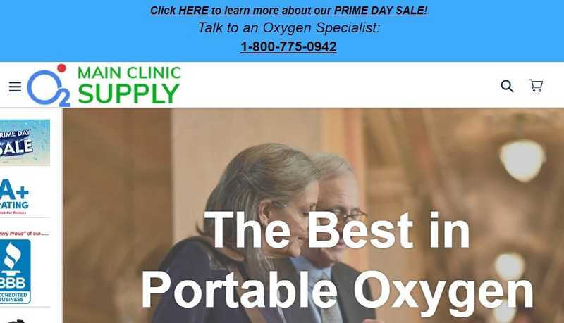
Let’s look at an example and see some of the design elements you can incorporate to boost trust. Main Clinic Supply has used many of the most common and obvious ones, so we’ll examine their homepage.
First, they clearly display a contact phone number at the very top of the page. This immediately signals that they are a real company: there is a human a call away you can talk to.
The All-in-One Platform for Effective SEO
Behind every successful business is a strong SEO campaign. But with countless optimization tools and techniques out there to choose from, it can be hard to know where to start. Well, fear no more, cause I've got just the thing to help. Presenting the Ranktracker all-in-one platform for effective SEO
We have finally opened registration to Ranktracker absolutely free!
Create a free accountOr Sign in using your credentials
Then, they feature three highly relevant trust badges: a price guarantee, an accreditation, and an authorized seller badge. All of these claims are easily verifiable with a couple of clicks.
Add to that the customer testimonials, the clearly listed address and phone number at the bottom of the page, the secure payment methods, and the “featured in” section, and you can see just how much effort has gone into ensuring that a first-time customer feels safe to browse further.
 Source: mainclinicsupply.com
Apply as many of these same trust symbols and signals on your own homepage, and your customers will certainly feel much more comfortable.
Show Your Products Being Used
Another common conversion obstacle will run along the lines of “how can I be sure what this product actually looks like.” No matter how many photos you show, the delivered item can still disappoint customers. After all, pixels aren’t yet quite able to replace a real-life product.
This is especially important for certain niches. Clothing, accessories, homeware, furniture, and all items where appearances matter alongside quality and functionality will benefit from design tactics that show the product in use in real-life scenarios.
Video is one way to demonstrate product size, appearance and quality. You can film anything from demo videos to how-to instructional clips, or just pure marketing material.
The All-in-One Platform for Effective SEO
Behind every successful business is a strong SEO campaign. But with countless optimization tools and techniques out there to choose from, it can be hard to know where to start. Well, fear no more, cause I've got just the thing to help. Presenting the Ranktracker all-in-one platform for effective SEO
We have finally opened registration to Ranktracker absolutely free!
Create a free accountOr Sign in using your credentials
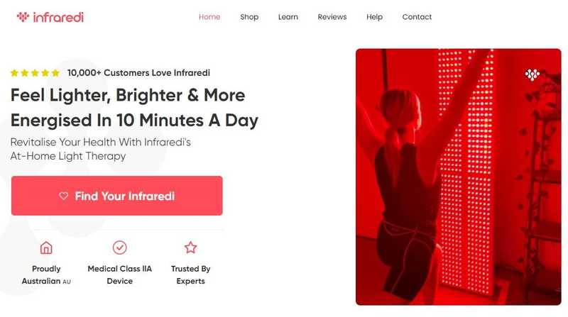
Infraredi does a good job with their homepage videos for example. They showcase their products being used in various scenarios, in an easy and effective way. Given that their product is somewhat unusual and not something you buy every day, this type of visual will go a long way in managing expectations and educating the customer at the same time.
Source: infraredi.com.au
You can use video on any type of page, but it will be most effective on the homepage and individual product pages.
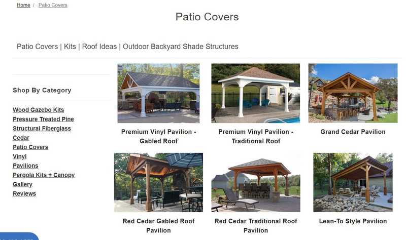
If you would rather use photos instead of video, check out this patio covers page for inspiration. Their photos have been taken by professionals, they all clearly put the product center stage, and they show it deployed in beautiful settings.
These kinds of photos make it much easier for the customer to imagine what the patio cover will look like in their garden. The emotions evoked are very positive, and effectively overcome any “what will this actually look like” objections.
Source: pergolakitsusa.com
Showcase Real Results
Depending on the nature of your product, you might also want to consider incorporating the results it can deliver. This is somewhat of a tricky point, as you don’t want to make unrealistic promises or set your customers up for disappointment, but you do want to show them exactly what they can expect.
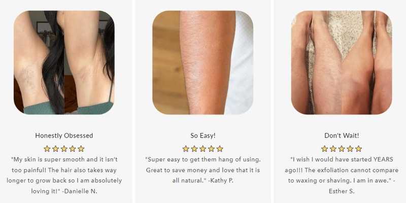
This tactic is especially important when there are specific results to be achieved. For example, a makeup or skincare brand can use this strategy well. Check out Sugar Me Smooth and how they use it to their advantage.
They showcase real-life results their customers have achieved by using their waxing products. The images are clearly real: they haven’t been retouched, and they have probably even been taken by their customers.
Source: sugarmesmooth.com
These images don’t set up customers for disappointment, but the product itself lends well to displaying positive “after” images. What if you sell supplements, where the results will greatly depend on a multitude of factors you can’t control?
Ideally, you will provide an asterisk and a brief explanation about the individuality of results and how they may vary. Make it very clear to your customers that you don’t guarantee they will look or feel a certain way. Display research results, survey results, and all the proof you have about the benefits of your product (for example, accreditation badges).
For instance, if you sell a stain remover, you can provide a bit of additional information about the before and after conditions. How old is the shirt in the ad, how long after the staining was the product used, things like that. It will help your customers better understand the effects of the product, and you will be building a lot of trust at the same time.
Simplify Conversion Functionality and User Experience
Once your potential customers have come to trust you and understand what the product looks like and how they can use it, it’s time to finally convert. If this process is not as simple and straightforward as it can possibly be, they will trip on the final obstacle in their path.
Checking out should be as simple as possible. It should take as few clicks as reasonable, it shouldn’t ask the customer for an excessive amount of information, and it should be fast and unimpeded.
Don’t keep offering additional products the customer can add to their cart in an intrusive way. Don’t ask them to sign up to your newsletter and throw multiple popups at them. Let them buy what they came for.
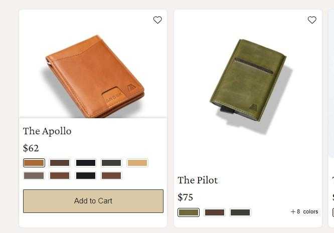
Start by making the “add to cart” step simple as well. This Men’s Wallets with Money Clip collections page is a good example of how this can be achieved. Customers don’t need to click on the product page itself. They can select the color of the item and add it to their cart immediately.
Another simple yet effective feature the brand uses is the express checkout option. They don’t try to make you create an account, sign in, and then shop. You can complete your purchase by filling out the usual form and be on your way.
 Source: andar.com
Show Availability From Collection Pages
Speaking of collection pages, there is another tactic you can employ there that will significantly speed up both the checkout process and improve the shopping experience.
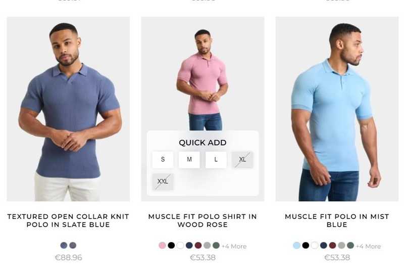
If you sell various sizes, colors, or other variations of an item, make sure you display them on the collections page. Clearly highlight which variations might be currently unavailable to minimize customer bounces and frustration. Shoppers won’t have to click through to a product page and click on a drop-down menu to realize the item they want is not available in their size.
This men’s muscle fit polo shirts collections page is a good example of how you can display product availability with a simple design tweak. The hover immediately tells you if the item is available in the size and color you’re interested in. As you can see, the pink option is not available in larger sizes.
Source: tailoredathlete.co.uk
This addition will allow customers to do all of their shopping from the collections page, especially if you also provide a carousel of images that can also be zoomed in right there (or a close-up photo of the item). By saving them the time to keep opening new tabs or going back and forth between pages, you will significantly improve their shopping mood.
Make Things Easy to Find
Finally, let’s consider one final functionality that you need to incorporate into your website design: search.
If you sell numerous items, you will need to make it as easy as possible for customers to find what they are looking for. You can’t expect them to be familiar with your inventory. You need to help them out as much as you can.
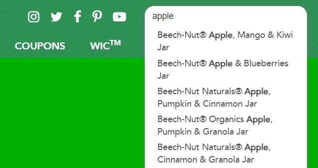
Look at Beech-Nut as an example. They have a very obvious search bar right at the top of the page. The entire menu is static, so you can easily click on an item or use the search feature wherever you are on the website.
This is a great tactic, as it will let your customers search while browsing. Perhaps they spot that you have a good selection of apple-based products. Wonder what else you have with apples? Easy to find with a sticky menu.
Also note how the results are displayed in an effective way. The search term is bolded, so you can quickly run through the other ingredients and see what you fancy.
 Source: beechnut.com
The All-in-One Platform for Effective SEO
Behind every successful business is a strong SEO campaign. But with countless optimization tools and techniques out there to choose from, it can be hard to know where to start. Well, fear no more, cause I've got just the thing to help. Presenting the Ranktracker all-in-one platform for effective SEO
We have finally opened registration to Ranktracker absolutely free!
Create a free accountOr Sign in using your credentials
If you choose to display products in card format, check out Meowingtons for inspiration. When you type in a search term like “bed,” you will instantly see a list of all of their cat beds. Once all the products have been displayed, you will also see all the blog posts they have written about cats and beds.
The best feature of their search results page is the filter on the right. You can quickly narrow down your search list based on availability or price and save yourself time browsing.
When designing your search bar, make sure it is always easy to reach. Consider what your audience is really looking for when displaying results. How can you make them maximally useful and easy to browse?
Wrapping Up
Have you already implemented any of these design tactics already? Which conversion obstacle is foremost in the minds of your customers? What can you do to help them overcome it more effectively?
Carefully consider our tips and determine which one would be the most useful to your ecommerce business. Start with the one that will have the most impact, and work your way through the list.

