Intro
According to studies, the number of active email users is expected to reach 4.7 billion by the end of 2026. Somewhere among them are your business’s potential and existing customers, making email marketing one of the most effective channels to reach them.
But to catch their attention, you must put all your efforts into building emails that stand out in their stuffed inboxes. There’s no better way to do that than investing in a stunning email design. \
Marketers who design their emails with past standards see their email marketing KPIs drop drastically. It’s important to be constantly on the lookout for the best practices to craft outstanding emails. So, let’s see what's trending today in email design.
6 Best email design tips for outstanding emails
Whether you opt for an HTML email template or the good old classic text-only email, creating effective emails goes hand in hand with following the best email design tips. Here’s what you should keep in mind to design unique emails this year and beyond:
Use email templates for a professionally looking result
Not every marketer has coding skills or is a design expert. But this doesn't mean they should limit themselves to plain emails. Instead, they can invest in email templates to start building stunning emails without breaking the bank or racking their brains. Using email templates is a bulletproof way to speed up email creation while ensuring every email you design is visually appealing and engaging.
So, where can you find professionally designed email templates that convert? There are several email template builders in the market giving you access to a wide selection of email templates. Here's what you should be looking for when choosing your tool:
- A user-friendly drag-and-drop email editor that lets you add, remove, and tweak email components in just a few clicks.
- An extensive library of email templates with responsive design to create readable emails that look good no matter the device they’re displayed on.
- Customization capabilities that allow you to add your brand assets and tweak your design according to your campaign goal.
- Conditional block features to display personalized email content based on predefined criteria like your audience’s preferences.
- Options to create your own template from scratch and save it in your template library for future use. This functionality is particularly helpful if you send specific email types regularly.
Write catchy and informative email subject lines
Subject lines are like book covers; they help readers decide whether they’ll buy and read the book. Likewise, subject lines are the determining factor for opening an email.
But how can you write subject lines that will grab recipients’ attention?
Aim for 50 characters or less so that they don’t get cut off on mobile devices. Also, ensure you communicate key information upfront. For instance, if you have a limited-time discount on specific products or services, you’d better highlight it in your subject line’s first few words. Remember that your subscribers will take a quick glance before moving to the next email.
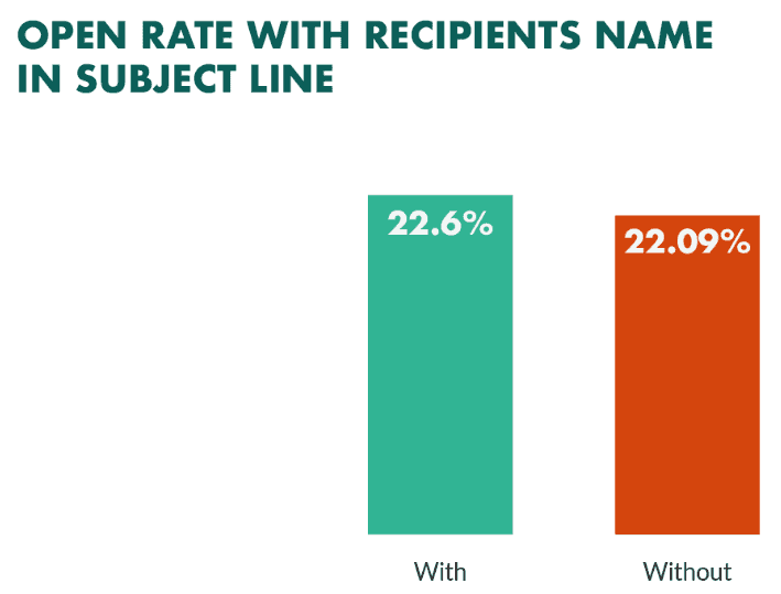
For the same reason, ensure you hook them from the beginning by including a question, a relevant statistic, power words, or amusing puns. And let’s not forget the most effective trick in the book: mastering the art of personalization. Throwing in a personalization element like their name or professional role works wonders for grabbing most readers’ attention:
The All-in-One Platform for Effective SEO
Behind every successful business is a strong SEO campaign. But with countless optimization tools and techniques out there to choose from, it can be hard to know where to start. Well, fear no more, cause I've got just the thing to help. Presenting the Ranktracker all-in-one platform for effective SEO
We have finally opened registration to Ranktracker absolutely free!
Create a free accountOr Sign in using your credentials
(Source)
It’s important to keep your subject line relevant to your email content, too. Recipients hate opening emails only to find out the content doesn’t match the promise made in the subject line. So, if you mentioned an exclusive discount, that’s what they should get. And whatever you do, stay away from spam-triggering practices that compromise your inbox success like:
-
Adding spammy words and phrases like “click here,” “cash,” “this isn’t spam,” etc.
-
Using excessive capitalization or punctuation like exclamation marks
-
Putting RE: or FW: to mislead readers if your email isn’t, in fact, a personal communication
-
Overdoing it with the use of emojis or special characters
Choose the right email layout
Poorly structured emails are hard to read and click through. An appropriate email layout, instead, helps readers prioritize the email content and focus on the most significant parts of your message. The goal is to help them consume content in the right order while directing them towards the desired action.
For instance, the zig-zag layout takes your viewer’s eyes from one side to another as they scroll through. This pattern makes your emails more engaging and the content easier to follow. When you use this scheme and add attention-grabbing email copy, recipients are more likely to read through your entire message.
Another layout that seems to be gaining ground is the single-column layout. This straightforward layout removes clutter and distractions, leading readers from point A to point B and, ultimately, to your email CTA. What’s more, it’s probably the most mobile-friendly layout, ensuring your emails render great on all devices.
The inverted pyramid layout allows you to catch the recipient’s attention at the top of the email with the wider part of your content. This could be an attractive image or headline that reflects your main message. Then, the inverted pyramid directs their attention at the bottom where the element that will drive conversions is placed-usually a call to action.
Optimize your email design
Once you pick a clean layout that guides your recipients’ eyes smoothly through the content, the next step is to optimize the email experience with the user in mind. Focus on simplicity and clarity while also considering the following factors to create the optimal email design:
-
With 42% of emails being opened on mobile devices, using a responsive design that renders perfectly on all screen types is a no-brainer.
-
Mind color contrasts, especially when it comes to important elements such as your CTA so that they stand out from the rest of the content.
-
Place your most important information at the top of your email since recipients are more likely to focus on the first elements they see.
-
Make sure you choose an email marketing service that allows you to thoroughly test how your emails are displayed across multiple devices and email clients.
-
Leverage white space between email components to separate them visually. White space gives your content room to breathe while communicating your message as clearly as possible.
-
Minimize the use of dense text. Instead, add headings, subheadings, and bullet points to make your emails more skimmable. Also, emphasize key words and phrases through bold text.
-
Consider creating a plain text version of your email for recipients using email clients and devices that don’t read images.
-
Maintain a balance between text and visual components to design a digestible and visually appealing email experience.
Don’t neglect the email signature
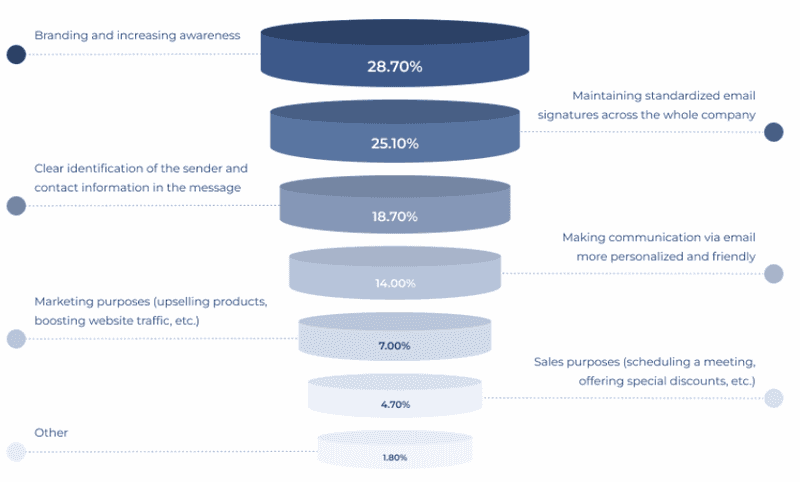
Unfortunately, some marketers think of their email signature as a legal requirement that’s useless to them. As such, they neglect it. The truth is that there’s more to it than including your company’s physical address or unsubscribe option. In fact, your email footer might prove to be an integral part of your email communications and serve various business objectives:
The All-in-One Platform for Effective SEO
Behind every successful business is a strong SEO campaign. But with countless optimization tools and techniques out there to choose from, it can be hard to know where to start. Well, fear no more, cause I've got just the thing to help. Presenting the Ranktracker all-in-one platform for effective SEO
We have finally opened registration to Ranktracker absolutely free!
Create a free accountOr Sign in using your credentials
(Source)
But let’s take it from the top by reviewing the main components of an appropriate email footer:
-
Physical address. Including your company’s physical address in your email is a legal requirement for any commercial brand that contacts consumers in Europe and the US. Apart from helping you stay compliant with legislation, it’s an additional contact point between your business and your readers.
-
Contact details. Every email you dispatch should have your reply-to email address, phone number, and customer support links. That's how you show subscribers you care about their experience and that they can get in touch with you anytime through multiple options. \
-
Social media icons. Your emails are an excellent opportunity to connect with your audience further by linking your social media channels in your footer. Email social media icons enhance the relationship between your recipients and your brand while driving social media traffic.
-
Call to action. It may come as a surprise, but your email signature is a great place to prompt subscribers to take specific action, such as visiting your website. Consider adding a clear, concise, and clear call to action that matches your brand assets and aligns with your marketing goals. \
-
Unsubscribe option. One of the main reasons recipients mark your emails as spam is having trouble finding your unsubscribe option. Adding such an option is a prerequisite for anti-spam compliance. Plus, by allowing readers to opt out through a visible unsubscribe option with precise wording your brand comes across as reliable and trustworthy.
A beautifully designed footer might serve as a last resort to highlight your value proposition. For best results, keep it clean, concise, and aesthetically pleasing. To make the process easy, invest in an email signature generator that allows you to create a professional signature in a few minutes. All you have to do is choose a template and customize all signature details to fit your needs and branding. Finally, it’s important to update your company information, if needed, to ensure accuracy and compliance with regulation changes.
Go dark mode
A recent study has demonstrated that 81.9% of Android Authority users operate their phones in dark mode. That said, optimizing your email design to work properly for readers using dark mode is essential. In simple terms, dark mode in design shifts the font to a light color on a dark background instead of the other way around.
Dark mode greatly benefits users as it reduces eye strain, especially in low-light environments. Less eye strain means subscribers stay longer with your email content, making it easier to consume and increasing engagement. Also, dark mode aesthetics appear more sophisticated while saving battery life due to reduced brightness levels.
So, if dark mode resonates with your target audience, check the following email design tips to adopt it properly:
-
Some images may not be as effective in dark mode as in light mode. Test whether your images work well with a dark background and provide alternative versions if necessary.
-
Mind your color palette since some of the colors you use might appear different in dark mode, affecting the aesthetic result.
-
Recipients should be able to recognize your brand assets, such as your logo, when choosing dark mode. If you have to, adjust the color scheme to maintain brand consistency.
-
Pay attention to your text formatting. Some formatting like bold or italics may not look good on dark backgrounds, so you’ll need to adjust it accordingly.
-
Dark mode is an excellent match for other popular email design trends, such as animated gifs or bold typography.
Follow user accessibility standards
Web accessibility has become an absolute necessity for every type of digital marketing activity. The same goes for your email design. As a marketer, you must think of your target audience as people with different needs and limitations. Designing accessible emails means you offer every subscriber an equal and outstanding experience, no matter the circumstances.
Did you know that at least 2.2 billion people worldwide experience some kind of vision impairment? On top of that, you have users with reading disabilities or hearing and cognitive impairments. If we only take dyslexia, it affects 20% of the global population. Here's a breakdown of how different disability types impact the email experience:
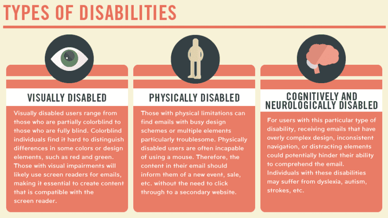
(Source)
Add to that the users with temporary limitations like noisy environments or commuting time. Needless to say, that’s a large percentage of your audience.
Creating accessible email campaigns allows you to expand your reach to diverse audiences. The question that arises is how you can do that. Here’s what you should keep in mind:
-
Add alt text to every image included in your emails so that people using screen readers or text-to-speech tools can grasp the message they convey.
-
Choose a clean and uncluttered layout with bulleted lists, white spaces, and headings to guide readers toward the most important information quickly.
-
Stick to clear and colorblind-friendly colors while using color contrast to enhance readability for users with visual impairments.
-
Opt for legible fonts for people with cognitive disabilities like dyslexia. For the same reason, add decent line spacing to let your text breathe.
-
Use dedicated tools to check your content’s readability level—a grade level of 8 is a good readability score. As a rule of thumb, avoid complicated sentences and jargon.
-
Do your research on color psychology to be mindful of the connotations that come with different colors and combinations.
Improve engagement with interactive content
Adding interactive elements gives you a competitive advantage since 60% of recipients find it more likely to engage with an interactive email. That’s because they can interact with your content without leaving your email. Interactive email content is a powerful technique that draws attention and urges readers to stick with your email long enough to drive conversions.
Not to mention that interactive components could turn a simple piece of information into a gaming experience.
The All-in-One Platform for Effective SEO
Behind every successful business is a strong SEO campaign. But with countless optimization tools and techniques out there to choose from, it can be hard to know where to start. Well, fear no more, cause I've got just the thing to help. Presenting the Ranktracker all-in-one platform for effective SEO
We have finally opened registration to Ranktracker absolutely free!
Create a free accountOr Sign in using your credentials
Now let’s check some popular interactive elements to incorporate into your email design:
-
Product-display widgets like product carousels
-
CSS animated buttons
-
Dynamic CTA buttons
-
Image rollovers
-
Gamification elements
-
Polls and surveys
-
Videos
However, we should mention that interactivity comes with limitations. First, remember that you shouldn’t overdo it with interactive components. With interactivity, less is more, so try not to include more than a few elements and mind their size to prevent slow loading times. And let’s not forget that too many interactive components overwhelm readers and distract them from your key message.
Also, bear in mind that not all email clients fully support interactive components, so you may have to build corresponding subscriber segments based on the email provider used. And even if you nail interactivity in your HTML email design, make sure you don’t stop experimenting with different types of components to find the ones that result in increased engagement.
Break through the noise with outstanding email design
Email marketing is an ever-changing landscape. Keeping up with the most effective email design tips is a recipe for success in staying ahead of the competition. Your emails should look up to date to catch your readers’ attention and convince them that you’re an industry expert.
This guide has detailed the best email design tips to help you stay on top of your email marketing efforts. However, it’s important to monitor the importance of your email campaigns so you can determine what resonates best with your audience and optimize future designs accordingly.
And don’t forget that stirring things up with different email design elements sometimes will do no harm. Surprising readers with new strategies keeps them interested and shows your business constantly meets their expectations.

