Intro
Are you also fed up with these trivial calls to action (CTAs)?
Then you’ve come to the right place. This article is an all-inclusive CTA tutorial with the best calls-to-action examples to add to your bag of marketing tools.
We’ve collected CTAs for –
- eCommerce store shopping
- Subscription forms (with and without lead magnets)
- Time-bound offers
- Holidays
- Surveys + quizzes
- Free trials
- Events
- Cookie consent banners
- Social media
What are CTAs, and are they worth the hype?
Let’s talk about this first.
What Is A Call-To-Action?
A call-to-action, aka CTA, is a marketing gimmick in the form of a text that prompts the audience to do something. Often, it’s a button with the text on it. Its purpose? To encourage people to act as instructed: visit the website, subscribe, add to wishlist, purchase, etc.
You already know the most famous example of a CTA. It’s “Shop Now”, of course. However, there are tons of other variants of calling to action. For instance, brands may also add CTAs to their exit intent popups to convince customers to stay on the web page and eventually end browsing in a sale.
The All-in-One Platform for Effective SEO
Behind every successful business is a strong SEO campaign. But with countless optimization tools and techniques out there to choose from, it can be hard to know where to start. Well, fear no more, cause I've got just the thing to help. Presenting the Ranktracker all-in-one platform for effective SEO
We have finally opened registration to Ranktracker absolutely free!
Create a free accountOr Sign in using your credentials
Can CTA buttons get enough clicks and improve conversion rates dramatically?
Read below.
Do Call-To-Actions Work?
In fact, they work like a charm. And there’s no exaggeration here.
A web page with a CTA button has a 120% higher conversion rate.
Let alone its potential in emails. A single call-to-action in email can skyrocket clicks by 371% and sales by 1617%.
One more fact for consideration:
The All-in-One Platform for Effective SEO
Behind every successful business is a strong SEO campaign. But with countless optimization tools and techniques out there to choose from, it can be hard to know where to start. Well, fear no more, cause I've got just the thing to help. Presenting the Ranktracker all-in-one platform for effective SEO
We have finally opened registration to Ranktracker absolutely free!
Create a free accountOr Sign in using your credentials
Landing pages with additional CTAs across the page drive 220% more conversions than those with a single call-to-action at the top.
You might need multiple CTAs to create a better landing page or spice up your email. No worries, we’ve prepared a backup with an ultimate list of calls to action. But before that, discover where and when exactly you should turn to those.
When And Where To Use CTAs?
It would be best to use call-to-actions at every stage of the lead generation funnel. Let’s look at the following scenarios.
- CTA usage scenario #1
When: the top-funnel stage, aka TOFU (awareness)
Where: advertisement, blog article, social media post
- CTA usage scenario #2
When: the middle-funnel stage, aka MOFU (evaluation)
Where: landing page, popup, email
- CTA usage scenario #3
When: the bottom-funnel stage, aka BOFU (conversion)
Where: product page, referral campaign
100 Calls To Action To Copy And Save For Every Need
Taste the juice of the article. Enjoy!
10 CTAs for eCommerce stores
Get customers buying with the best call-to-action examples and grow your eCommerce sales instantly:
- Get this look
- Try it out
- Shop new arrivals
- _Check out our range of new _____
- Order & pay now
- _Find everything you need for _____
- Treat yourself today
- _Be a star gift giver this holiday season by shopping _____
- _ Just landed. Explore now_
- _ Get ahead of holiday shopping_

30 CTAs for subscription forms
How about making a winning lead generation form with one of the CTAs listed below?
10 CTAs for signup forms without a lead magnet
Force your visitors to type their emails into your email signup form. But please, be gentle:
- Hop in!
- Subscribe and stay tuned!
- Count me in!
- Become a member
- Click here to subscribe
- Be the first to know
- Join newsletter
- Get instant access
- Keep me updated
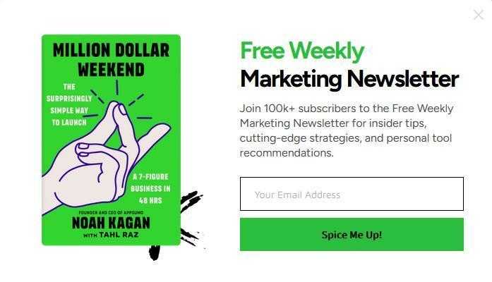
- _ Spice Me Up!_
20 CTAs for signup forms with a lead magnet
Before writing a CTA text, you should create a powerful lead magnet like a unique offer (coupon or discount for eCommerce) or a downloadable item like an ebook, checklist, cheat sheet, whitepaper, etc.
10 calls to action for special offers:
- Unlock offer
- Awww yes!
- Reveal my discount
- Get the deal before it’s gone
- Redeem my prize
- Get X% off your first order
- I want!
- Grab the offer
- Snag coupon
- _ Claim my secret code_

10 calls to action for downloadables:
- Send this to my email
- Yes Please!
- Get it now
- I want my free copy
- Grab now
- I need this →
- Download PDF
- See what’s inside
- Email me this
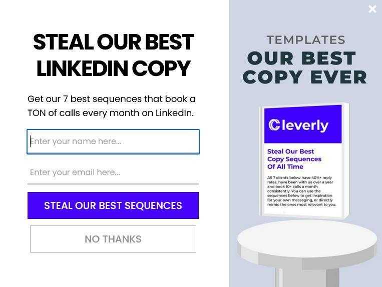
- _ Steal our _____
10 CTAs for limited-time offers
Why not use high-converting calls to action in your email subject lines? You can emphasize the time limit, evoke a sense of urgency + the fear of missing out, and boost your email open rates immensely. Refer to the examples below.
- Look up: X% off ENDS TONIGHT!!
- Last call... you in?
- _Don’t miss this! Last chance to save big now with X% off _

- Time’s running out. Get an EXTRA X% off now
- Don’t forget your $X gift. Expires soon
- _Don’t Miss Out on Hot Savings! _

- Enjoy X% Off Sitewide | This Only Happens Once a Year
- Save up to X% off while you still can!
- _ Hurry, We Have the Last Few _____ Left!_
- And... GO: The sale is officially open.
10 CTAs for holidays and seasonal activities
Trick or treat?
Get a treat from us – ten killer CTAs for your holiday calendar:
- Independence Day: Light up your 4th with up to X% off
- Memorial Day: Let’s honor our heroes on Memorial Day
- Earth Day: Join us in celebrating Earth Day
- Father’s Day: Save the day with the perfect Father’s Day gift
- Mother’s Day: Celebrate mom’s beauty this Mother’s Day with your exclusive X% off offer
- Halloween: Save like a bat out of hell on Halloween!
- Black Friday: Less than 100 days until Black Friday – don’t wait, take X% off today!
- Spring: Go green for spring
- Summer: Relax into summer with us
- ** Festival season**: Get festival-ready with our _____ essentials!
5 CTAs for quizzes and surveys
Need a helping hand with surveys or quizzes? Make your customers answer your survey or quiz with the most effective call-to-action buttons:
- Let’s go
- Begin quiz
- Start the survey
- Let’s do it!
- Take test
If you’d like to create a product recommendation quiz for your eCommerce store, you may opt for such CTAs as Find Your Match or Find Your Fit in 5 Minutes.

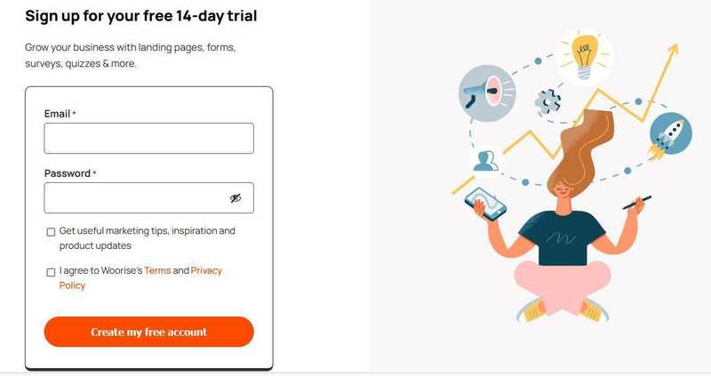
10 CTAs for free trials
A free trial is by far the most foolproof method to generate SaaS leads. If only you “arm” it with a good CTA:
- Join free for a month!
- Claim my X-day free trial
- Start using ____ without a credit card
- Interested? Let’s make a change together
- Start free or get a demo
- Get started at no cost to you
- Enroll for free
- Give _____ a try. It’s free for X days
- _ Try it free_
- _ Create my free account_
10 CTAs for social media
One of the below calls to action can help you persuade your target audience to join your kingdom and become the king or the queen of marketing on social media:
- Head to the link below
- Come in store
- Hey, check this video. We got you a little somethin’
- Tap to shop
- Get it, it’s available now
- Psst… You get an X% off for your brilliant smile. Use ____ promo code at checkout.
- _ Want to discover more? DM me_
- Do you agree? Drop Yes or No in the comments!
- _ Take a peek at how _____
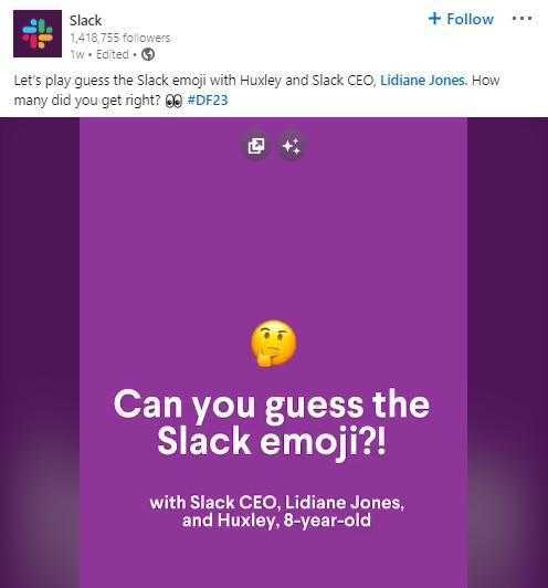
- _ Let’s play _____
10 CTAs for events
Have you ever experienced no-shows at your online events?
Compel people to attend and increase the show-up rates with one of these:
- Smash the “Attend” button!
- Yes! I’ll be there
- Please get your tickets while they’re hot
- Mark your calendars!
- Register today to secure your spot.
- Don’t mullet over. Come and say hello
- Save my space
- Seats are limited. Hurry to book yours!
- More info and register here
- _ Book my seat_

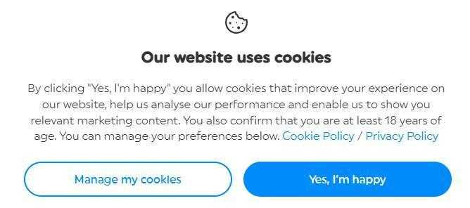
5 CTAs for cookie consent messages
Take care of your cookie popup text, too, because cookies power up hyper-personalization in marketing.
- Got it | Customize
- _I agree | I don’t agree _
- _Accept all cookies | Let me choose _
- OK! | Set cookie preferences
- Yes, I’m happy | Manage my cookies
6 Expert Tips for Making CTAs That Drive Conversions
Finally, the cherry on top of this guide. Universal best practices to watch conversions lift with call-to-actions.
1. Place your main CTAs in the above-the-fold
Look at the above-the-fold of your site’s homepage.
How many CTAs do you have there?
Strong calls-to-action placed in this area can help you capture leads on your website. To make them work even better, heed the call from Jesse Hanson, Content Manager at Online Solitaire & World of Card Games:
“You can multiply your lead-capturing efforts by adding several CTAs to the above-the-fold of your landing page. It’s also advantageous to make them mimic the F-shaped reading pattern on the web.”
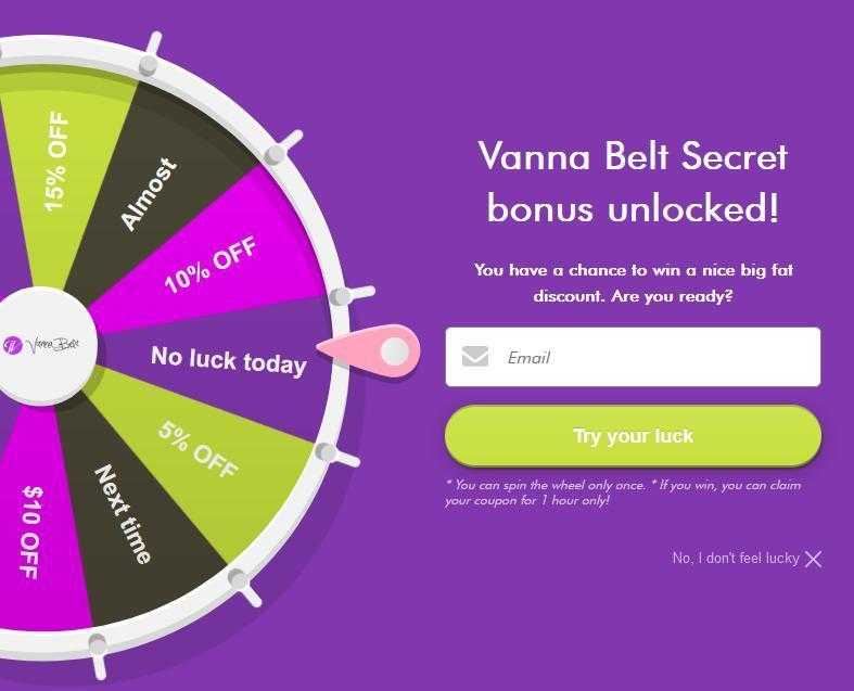
2. Gamify your call-to-actions
With a gamified CTA, customers are 20% more likely to perform the desirable action.
Jerry Han, CEO of PrizeRebel, explains how eCommerce businesses take advantage of gamification in their calls to action: “By gamifying interactions with their audiences, eCommerce brands rely on the desire to win and offer prizes. For example, customers can play games, spin wheels, or participate in giveaways to win rewards.”
PrizeRebel isn’t an exception. The company creates viral giveaways and contests on social media.

Here’s a list of gamification-driven CTAs:
- Spin to win
- Grab your prize
- Redeem my reward
- Let’s play!
- _Feel lucky today? Win _____
- Try your luck
- Round your CTA buttons
Yes, shape matters.
Roundness is more pleasant to a human’s eye than sharpness. Researchers prove rounded edges are easier on the eyes than sharp ones. They also impose a lesser cognitive load and reduce the sense of danger.
“Using the psychology of shape is essential if you want to create a compelling call-to-action button,” claims Michael Power, CMO at Ninja Transfers.
“By rounding the edges of your CTA buttons, you can ensure a smoother feel and better usability, whether in-app or on the website. Moreover, rounded shapes make people focus on the insides. In our case, it’s a call-to-action text. On the contrary, sharp-corner buttons point outward,” he notes. So, it may be the best time to analyze your lead capture page. What if your sharp-like-a-knife CTA button cuts your visitors off?
4. Strive for complementary contrast in CTA colors
Now, to color psychology.
It’s commonplace for artists and designers to lean on complementary colors – the complete opposites on the color wheel. They create a strong contrast and grab people’s attention instantly.
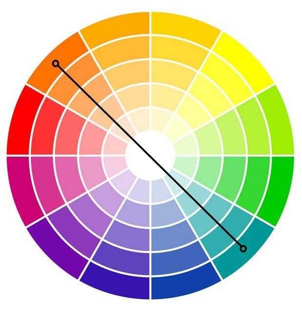
Thanks to Jim Pendergast, Senior Vice President at altLINE Sobanco, the tactic saw life in this article. He provides an example from the financial industry:
“One of the color rules of thumb for finance brands,” he says, “is to choose blue because it conveys trust, security, and reliability. However, some companies go beyond that and merge two complementary colors, namely blue and orange, in their designs. Let’s take SunTrust Bank, ING, or Citibank, for example. It can be beneficial to do the same when picking the colors for CTA buttons.”
Actually, that’s what altLINE Sobanco does on the website to create high-converting forms.
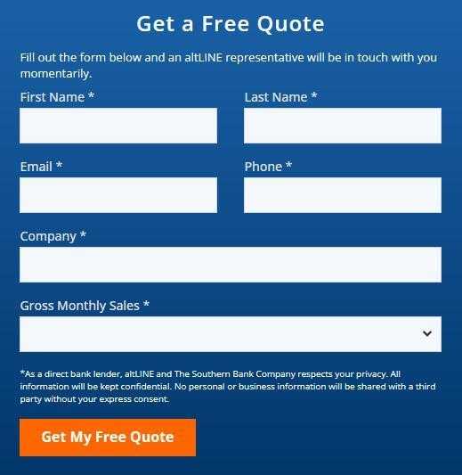
Below are the perfect color combinations to bring contrast and dynamics into your call-to-actions:
- Orange + blue
- Green + red
- Yellow + violet
- Yellow-green + red-violet
- Blue-green + red-orange
5. Experiment with persuasive writing tactics
According to Linda Shaffer, Chief People Operations Officer at Checkr, “When crafting a call-to-action, you should write as persuasively as you can to push people to go ahead and take the step you expect from them. The best ways to do that are to apply repetition and the rule of three in writing CTAs.”
Checkr, for instance, repeats the first word of the phrase twice in the headline CTA: Unlock talent. Unlock opportunity.
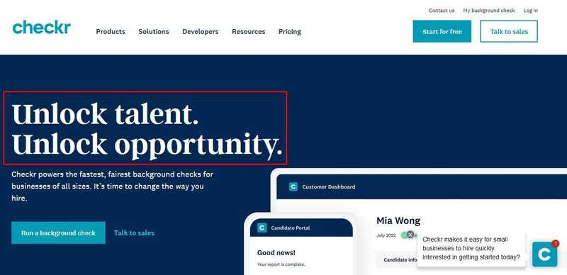
Repetition is one of the caption hacks on Instagram, too.
What’s the rule of three, then?
It is a storytelling pattern – three words or phrases that make a pleasant reading rhythm. See it in action at Beauty Bay: Glitter. Sparkle. Shine.

6. Sound more natural and casual
How exactly?
Take it from Morgan Taylor, Co-Founder of Jolly SEO. He says, “It’s better to keep a more conversational tone and follow the write-like-you-speak principle in your CTAs. It helps you build authentic relationships with your audience. You can also use emojis and humor.”
The All-in-One Platform for Effective SEO
Behind every successful business is a strong SEO campaign. But with countless optimization tools and techniques out there to choose from, it can be hard to know where to start. Well, fear no more, cause I've got just the thing to help. Presenting the Ranktracker all-in-one platform for effective SEO
We have finally opened registration to Ranktracker absolutely free!
Create a free accountOr Sign in using your credentials
Jolly SEO, for example, maintains an informal communication style in the email newsletter with the Check it out CTA.
Write the way you talk:
- Gimme
- Wanna get this? Tap and grab
- Yay! You’ve won, take your prize!
- Yup, subscribe me
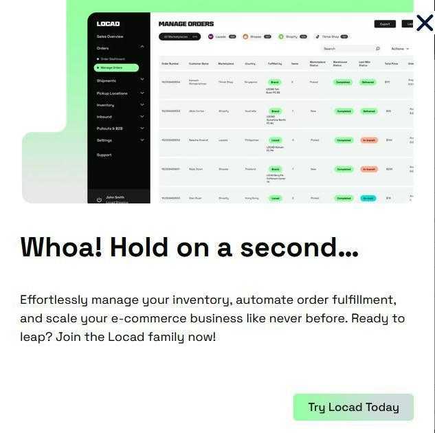
- Whoa, hold on a sec
You can also type CTAs in all caps: GIMME. Look at this email subject line from Bark: Do NOT Tell Your Mother!
Alternatively, try some fun wordplay like AppSumo did in this CTA: Don’t worry, be app-y.
Make Your Call To Action A Heavy-Hitter
The only thing left is to craft calls-to-action that convert your audience into new customers via subscription forms, landing pages, quizzes, etc.
P.S.: Don’t forget to take a peek into this list of CTAs whenever needed.

